

A community website redesign focused on accessibility and modern UX.
Overview
This project focused on redesigning the Desa Lalumpe (village website)—utilized for sharing community news, government updates, and promoting tourism.
The main goals were to make the website more engaging, easier to navigate, modern in appearance, and accessible to users of all ages.
Client’s Pain Points
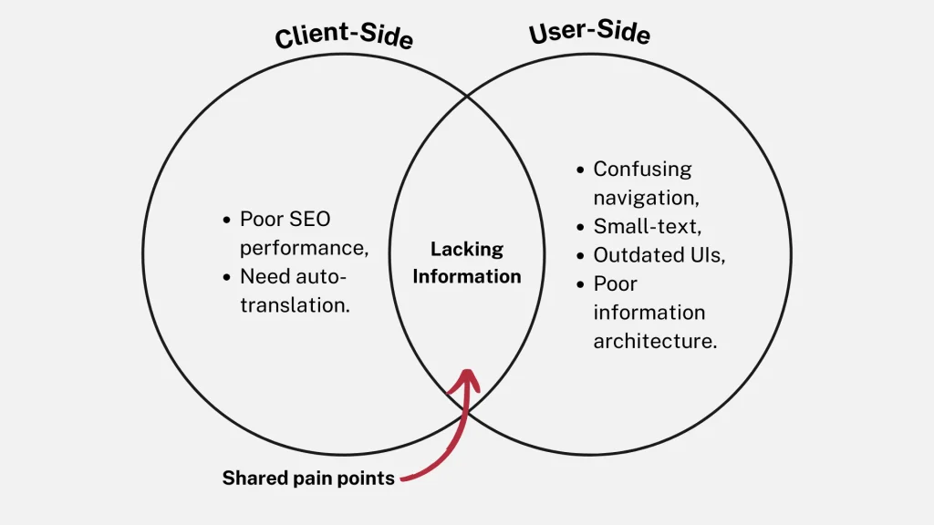
- The old HTML site was slow and affected by poor performance and SEO.
- It lacked sufficient information about the village and its activities.
- They needed an automatic multilingual feature.
My Approach
- Migrated the site to WordPress for better performance and scalability.
- Ran a user study to define user needs.
- Redesigned the site for improved information architecture, SEO, and automatic language switching.
My Role & Contribution
#1 UX Researcher
Led user interviews with village members to identify issues & pain points. Synthesized qualitative insights into clear design goals.
#2 WordPress Developer
Independently migrated the HTML site to WordPress using the Flatsome theme—resulting in 32% site performance improvement!
Constraints
- Timeline: 1 month (August 2023).
- Scope: Improve site and migrate to WordPress.
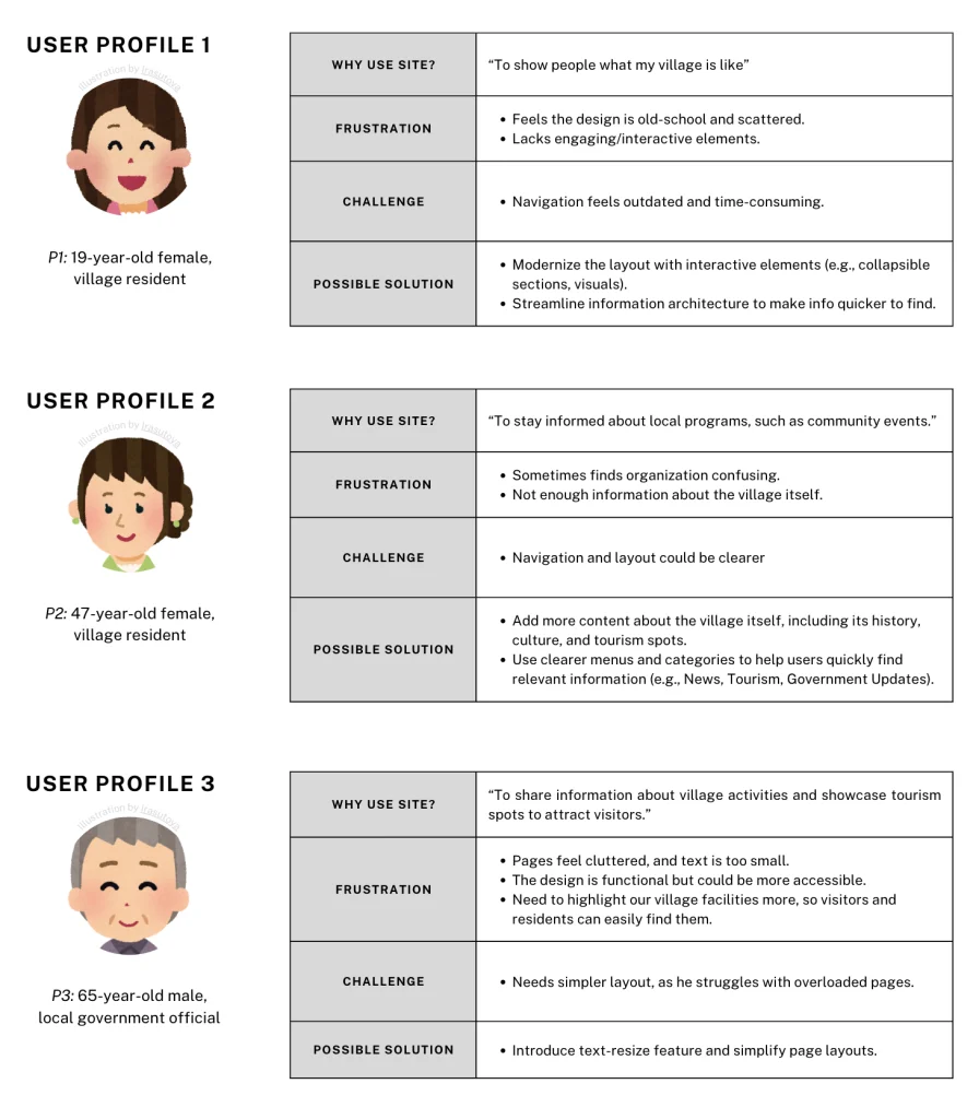
User Interview
User Profile
This persona is based on insights from our real interviewees (n = 3).
The profile reflects actual feedback and behaviors gathered during user interviews
Q&A Sample (Translated from Indonesian)
- P1: “The information is there, but it takes a bit of digging. The current layout seems a bit dated and scattered.”
- P2: “It’s fairly straightforward, though sometimes I find the organization of information a bit confusing.”
- P3: “I can find what I need, but the text is a bit small and the pages are cluttered. It would help if there was a way to adjust text size or simplify the layout for easier reading.”
- P1: “The website feels a bit old-school to me. I think it could benefit from a more interactive elements.”
- P2: “I prefer larger fonts and a more high-contrast color scheme for easier reading.”
- P3: “The design is pretty functional”
- P1: “It’s okay for getting basic information.”
- P2: “It meets my needs, but I think it could be more user-friendly with clearer navigation.”
- P3: “It’s somewhat satisfactory, I appreciate the depth of information provided.”
Users’ Pain Points
- Navigation: Users found the site structure confusing, making it hard to find information.
- Performance: The site was slow to load and not fully responsive.
- Accessibility: Some users needed larger text and higher contrast for better readability.
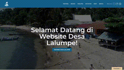
Preview: Site Before Redesign
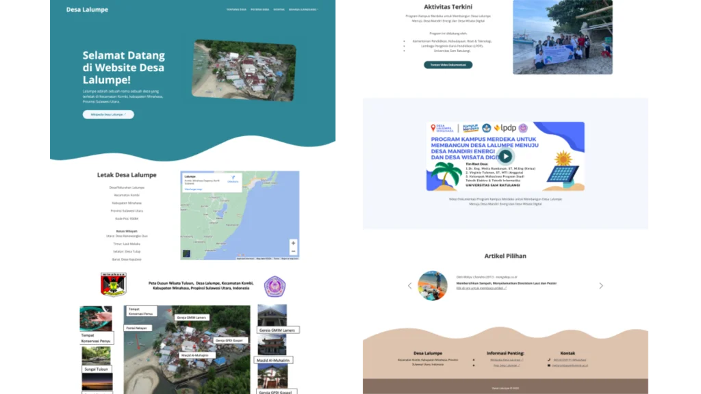
Redesign
Goals
- Create a clean, modern interface that appeals to more demographics.
- Simplify navigation to improve findability and user flow.
- Enhance accessibility to accommodate more users (e.g., text resize option, auto translate)
- Integrate responsive design for optimal viewing on all devices.
Point 1: Modern UIs
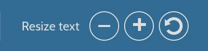
Point 2: Font Resize Option
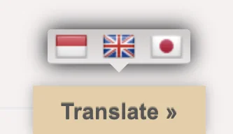
Point 3: Multilingual Support (Auto-Translation)
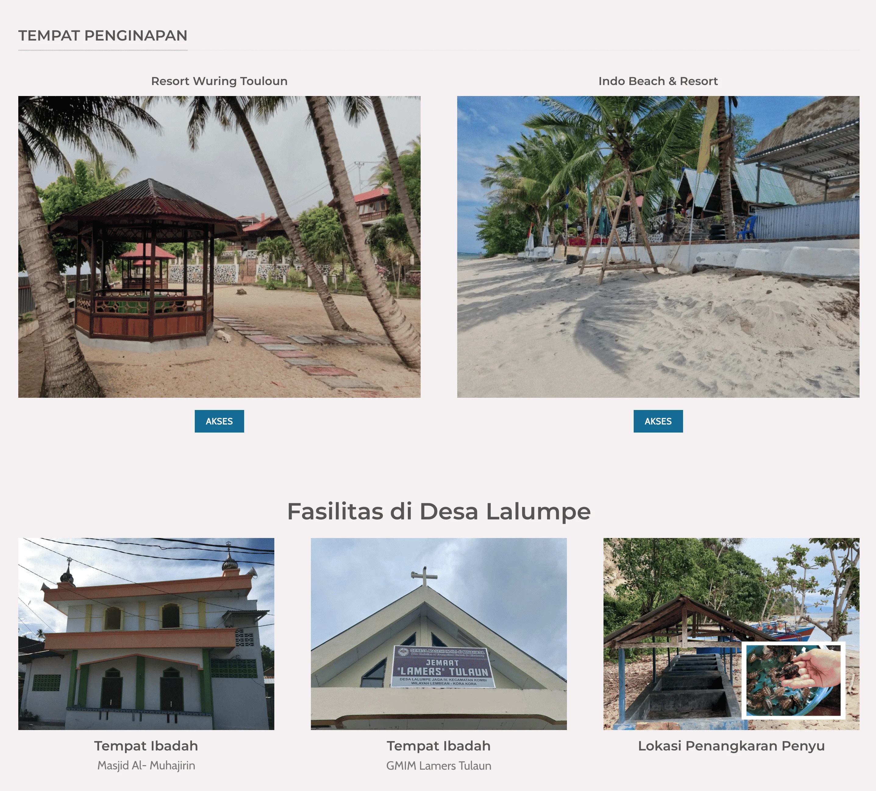
Point 4: Information Architecture
Simplify the structure so users can easily find key information, such as local tourism spots
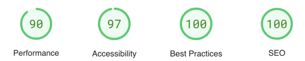
Result: SITE IMPROVEMENT
Before site redesign (2021)
After site redesign (2023)
Some tips…
To ensure a smooth and responsive experience for all users, I optimized my course page following suggestions from Google PageSpeed Insights. These optimizations were primarily aimed to faster load times, as this site as pretty heavy on media such as image and videos.
Tools (FREE WordPress Plugin):
- I used the WebP Express plugin to automatically serve lightweight
.webpimages instead of heavier.jpgor.pngformats. - I also used the Bulk Smush plugin to compress existing media library images in one go. This helped minimize bandwidth usage and improved overall page speed.
Summary & Reflection
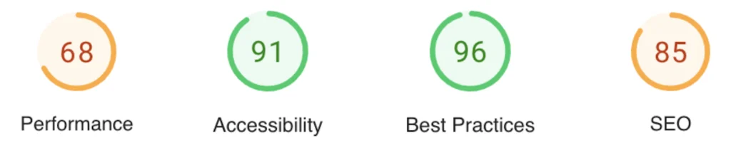
In just one month, I led the full redesign and migration of a rural community website—handling both UX research and front-end development. The new site saw a 32% boost in performance (score 68 to 90) and a perfect SEO score, thanks to the improved structure and responsiveness.
However, the most valuable part of the project was visiting the village and interacting with the locals. I was genuinely moved by how eager they were to embrace technology—this website being a great example of their enthusiasm.
One very necessary insight came from a user who mentioned struggling to read small text on the old site. That conversation sparked the idea to include a font resize feature—not just for this project, but also for my own website. It was a small change, but one that made a big difference in accessibility.