

Project Overview
What is a Dark Pattern?
A dark pattern (also known as a deceptive pattern*) is a sneaky design trick used to manipulate users into doing things they didn’t intend—like signing up for subscriptions, buying extras, or sharing personal data.
*this case study will use the term “dark pattern” due to its larger familiarity in Japan.
Let’s take a look at two examples of dark patterns below:
Relentless prompts (e.g., “Turn on notifications”) that disrupt the user repeatedly. No permanent opt-out, so users are pushed until they eventually give in just to stop the annoyance.
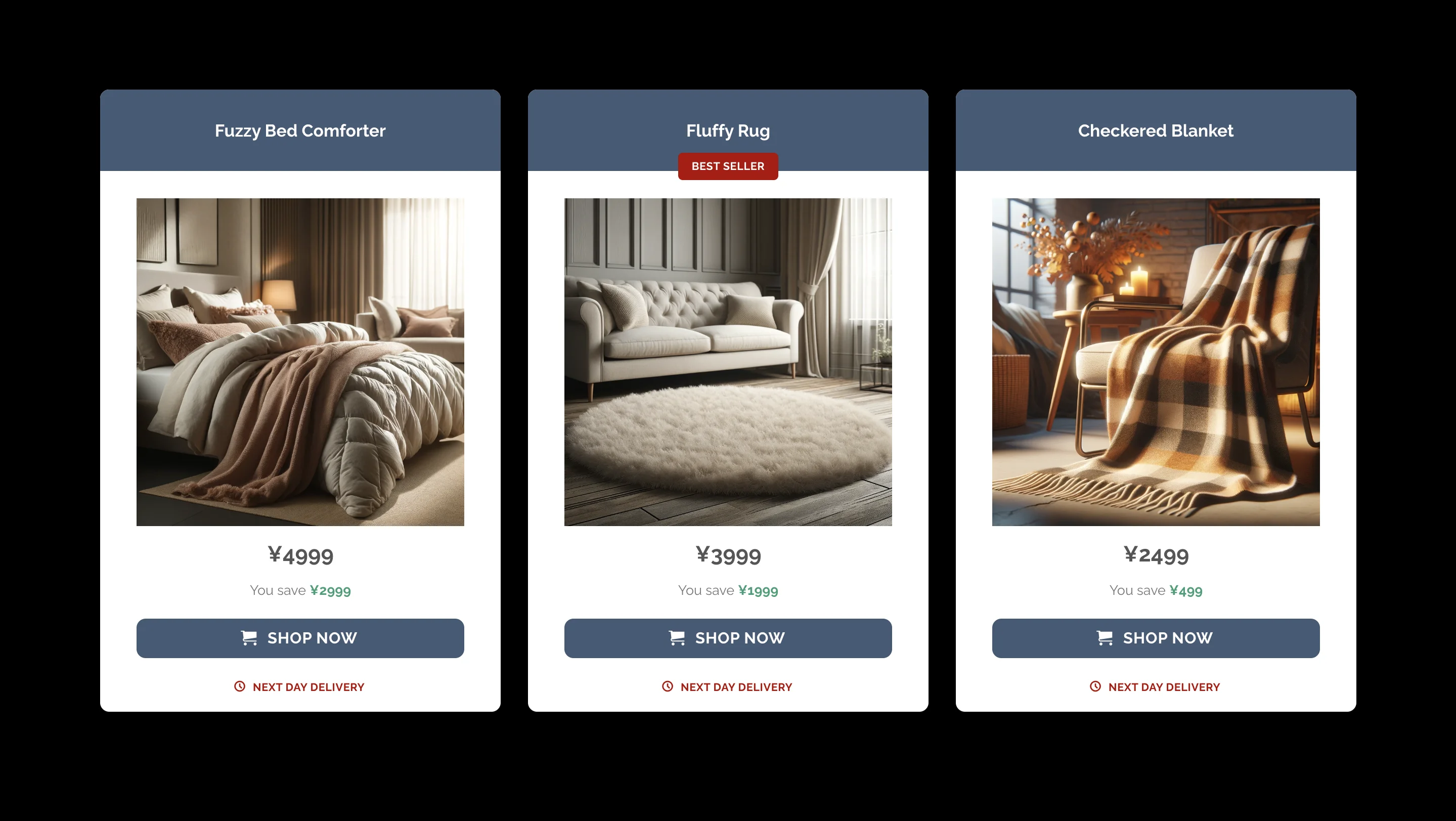
Stay Updated!
Turn on notifications to stay informed about the latest updates, special offers, and exciting news. Don't miss out!
Turn On Notifications Remind Me Later Not nowShames users into compliance by framing rejection negatively (e.g., “No, I don’t want to save money”), pushing them to accept offers they’d typically refuse.
TL;DR: Dark patterns trick users, harm trust, and backfire on companies. Good UX avoids them.
My Role & Contribution
#1 Researcher
Led a 353-user study uncovering dark pattern awareness gaps in Japan, published in peer-reviewed conferences.
#2 Product Designer
Built an interactive course to help users spot manipulative designs, bridging research and UX.
Skills
- 0-to-1 Product Design
- User Research, Survey Design (Qualtrics)
- Data Analysis (MATLAB & Python)
Why this matters?
- For Users: dark patterns can lead to frustration, unwanted purchases, and a loss of trust in digital platforms.
- For Companies: While they might boost short-term metrics, they harm long-term reputation and can lead to legal risks (& fines for unethical practices!).
Curious how users really feel?
Our short survey report, based on a study with 353 participants in Japan, reveals the reality.
Participants were Japanese adults recruited via the Yahoo Crowdsourcing platform. Table 1 presents the most frequent participant characteristics.
Table 1. Summary of Most Frequent Participant Characteristics
|
Variable |
Most Common |
Count |
Percentage |
|
Age |
45–54 |
123 |
34.8% |
|
Gender |
Male |
248 |
70.3% |
|
Education |
University graduate (bachelor) |
174 |
49.3% |
|
Employment |
Full-time |
192 |
54.4% |
|
Tech |
Intermediate |
217 |
61.5% |
|
Internet Use |
Daily |
346 |
98.0% |
|
Device |
Smartphone |
183 |
51.8% |
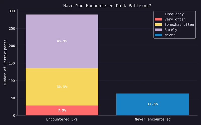
Most Users Encounter Dark Patterns — They Just Don’t Know It
- Once participants were shown what dark patterns look like, over 82% realized they had encountered them before.
- They just hadn’t recognized them at the time.
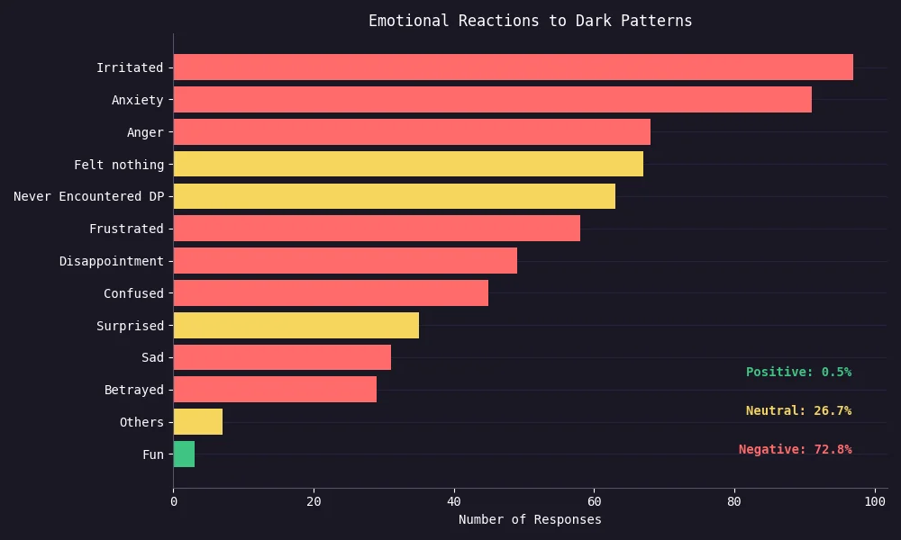
Deceptive Designs Make People Feel… Bad
- Among the 72.8% negative reactions, most users felt irritated, anxious, or angry.
- Just 0.5% found it “fun” 😅
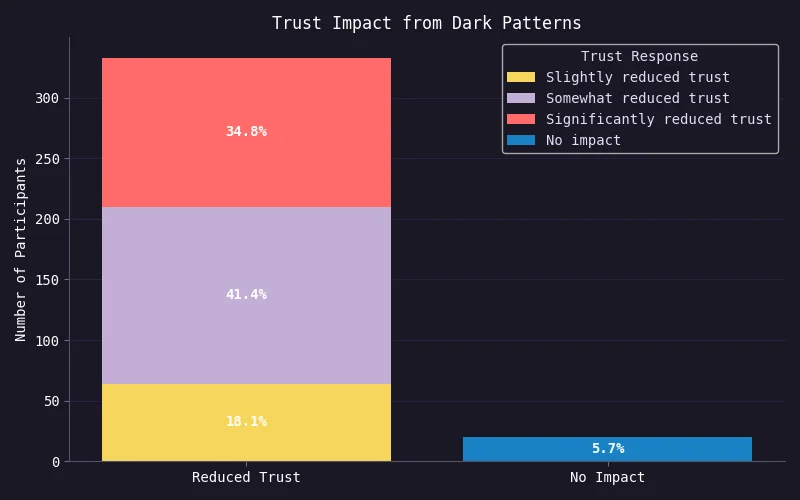
User Trust Takes a Hit
- Only 5.7% said dark patterns had no impact on their trust.
- The rest — over 94% — reported a decline in trust.
Most Users Would Leave
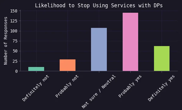
“If you discovered that a website uses dark patterns, how likely would you be to stop using its services or products?”
-
59% said they’d stop using it,
-
11% would probably keep using it.
, But They Stay Because…
Even when users notice dark patterns, many keep using the service:
-
39% still need it
-
29% say it’s too convenient/familiar
-
21% don’t know alternatives
They’re not loyal — they’re stuck.

Charts styled with Rose Pine for Matplotlib (credit: h4pZ on GitHub).
Dark pattern recognition ability
Our Experiment
The same 353 participants who shared their reactions in the previous section also completed a dark pattern recognition test.
This test was conducted before they were shown any explanation or examples of what a dark pattern is.
Our goal was to examine how participants’ awareness of dark patterns related to their ability to recognize deceptive designs.
To start, we asked how familiar they were with dark patterns and grouped them into four awareness levels based on their responses.
We asked participants, “What is your awareness and understanding of the term dark pattern?”
- Level 1 – Know and Understand: “I understand what DPs are and how they work”
- Level 2 – Heard but Don’t Understand: “I’ve heard the term ‘dark patterns,’ but I’m not sure what it means.”
- Level 3 – Aware of Manipulation: “I recognize websites can be sneaky, but I’ve never heard the term ‘dark patterns.’”
- Level 4 – Unaware: “I’ve never heard of ‘dark patterns’ or knew websites could trick me.”
Over 50% of participants were unaware of deceptive pattern…
Can Japanese users recognize dark pattern?
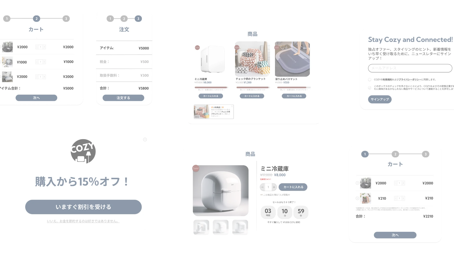
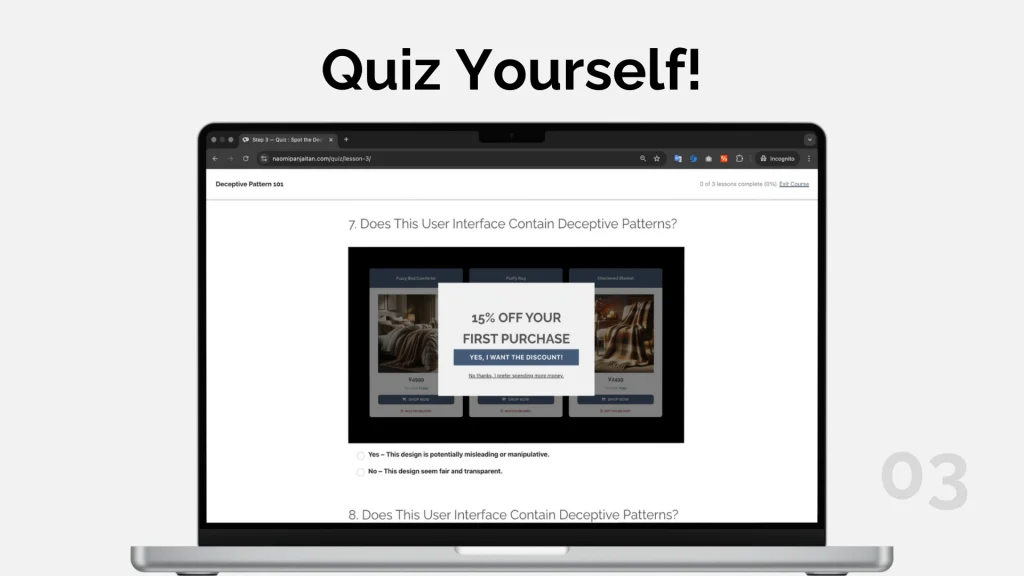
To find out, we showed participants 8 user interfaces and asked:
“Does this design seem manipulative to you?”
Based on their answers, we calculated their dark pattern recognition score—essentially, how good they were at spotting these sneaky designs.
Recognition Score Distribution
Each participant’s recognition score is calculated by:
-
True Positive Rate (TPR): How often they correctly identified dark patterns as manipulative.
-
False Positive Rate (FPR): How often they wrongly thought non deceptive designs were manipulative.
The final score is TPR minus FPR.
➔ Higher scores mean better at spotting real dark patterns without false alarms.
Surprisingly, group with the highest level of awareness perform the worst..
Potentially because…
-
Overconfidence: They might have been too sure of their ability, leading them to overlook subtle tricks.
-
Limited Understanding: They may have only recognized certain types of deceptive patterns, missing others entirely.
Product design phase
From Insight → Intervention
Our research revealed a critical mismatch: even those who claimed to understand dark pattern performed poorly in detection tasks.
🧠 Problem statement: there is a gap between users’ perceived understanding and their actual ability to recognize dark patterns in context.
🎯 Goal: to bridge the aforementioned gap, I want to educational interventions that help users develop dark pattern-spotting skills.
Process
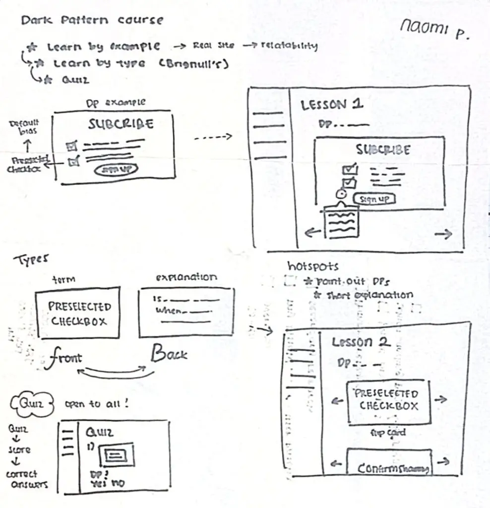
(1) Brainstorming (& Sketching!)
I began with quick sketches of potential learning tools and content flows.
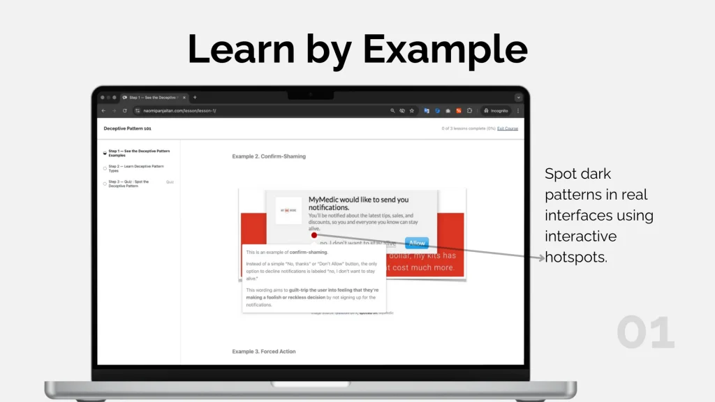
While sketching out the course experience, I quickly identified hotspots as a core interactive element to guide user learning.
Hotspots are UI cues (e.g., glowing markers or red dots) that draw attention to specific parts of the screen—commonly used in onboarding or walkthroughs.
(2) Development
After brainstorming and sketching core interactions, I made the decision to move directly into development instead of building a traditional high-fidelity prototype.
Why?
- Since I was both the designer and implementer, I could iterate directly in code without needing handoffs.
- The interaction model was already simple and well-scoped (hotspots, flip cards, quizzes), making a prototype an optional step.
Testing
Usability Test
To evaluate the initial version of the course, I conducted usability testing with two participants.
- Participants: 2 testers (one in India, one in the USA)
- Location: Remote
- Methods:
- Moderated Testing: Rated aspects like quiz difficulty and navigation ease.
- Unmoderated Testing: Users completed the full learning flow (Lesson 1 to final quiz) independently and reported observations.
(1) Key Findings
- Quiz Performance: Both scored 75% on the final quiz, establishing a strong baseline for recognition ability.
| Question | Feedback |
|---|---|
| ⏱ How long did it take to finish the course? | User 1: 40–50 mins User 2: 15–20 mins |
| ❓ How hard was the quiz? | User 1: Easy (2/5) User 2: Medium (3/5) |
| 🧭 Was the course easy to navigate? | User 1: “Course is good” User 2: “Simple and good” |
| 🐞 Any bugs or technical issues? | No technical issues reported |
(2) Usability Improvement
One tester noted:
“I had to sign in just to see my quiz score.”
This contradicted my goal of keeping the course fully open-access, so I immediately removed the sign-in requirement to make the experience frictionless for all users.
(3) Visual Improvement
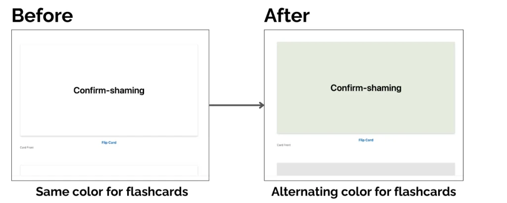
During user testing, participants provided the following feedback:
“The blue pointer blends too much with the provided example”
“All the flipcards look nearly identical…”
To address these concerns, I made two key visual improvements:
(a) Hotspot Update
A hotspot is an element that when you hover it reveals more information without being disruptive.

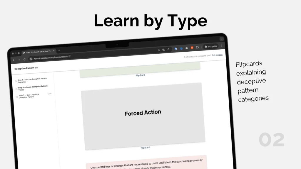
(b) Flipcard Improvement
A flipcard (also known as a flashcard) is a UI element that flips to reveal information on its reverse side—commonly used in educational tools.
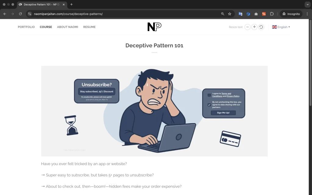
Product Summary: Deceptive Pattern Course
Summary & Reflection
I designed an interactive online course to address a key finding from my research with 353 Japanese users: even those who claimed awareness of deceptive patterns struggled to recognize them, particularly subtle ones.
This project pushed me to bridge both research and design seamlessly—I honed my ability to translate research findings into actionable, interactive design.
Moreover, the unexpected finding that even younger, educated users with intermediate tech skills were highly vulnerable challenged my own assumptions as a designer and reminded me that digital literacy does not always equal critical awareness.
Moving forward, I will approach design with greater sensitivity, ensuring that users never feel unintentionally manipulated by the design.
Publications
Feel free to explore my academic papers on this topic. If you find any insights from this page useful, you’re welcome to cite the paper listed below:
Deceptive patterns in Japan’s digital landscape: Insights from user experience
Download paper (accepted manuscript version)For the peer-reviewed, published version, please access it through Springer or read it online via Springer’s SharedIt.
Panjaitan, N. V., & Watanabe, K. (2024). Deceptive patterns in Japan’s digital landscape: Insights from user experience. Communications in Computer and Information Science, 99-108. https://doi.org/10.1007/978-3-031-61966-3_12
Gray Areas between Persuasion and Manipulation in UX Design: An Exploratory Study in Japan
Download paperPanjaitan, N. V., & Watanabe, K. (2018). Gray Areas between Persuasion and Manipulation in UX Design: An Exploratory Study in Japan. In The 10th IEEE ICCE 2024.